

Apple’s new wearable spatial product, Apple Vision Pro, brings a huge new wave of excitement to the whole tech community. Countless reviews and reactions have come out on all kinds of social media; potential users and tech industry workers have all kept their eyes focused on the news. As a product designer going into the field as a university student, I am also excited that we have this brand-new opportunity waiting for us to explore. I would like to use this post to outline the current opportunities in the designing for the new Apple Vision Pro, as I went through the reviews, Apple’s new guideline videos for WWDC23, and other designers’ comments. A compilation of sources can be found at the end of this article.
UI Trends
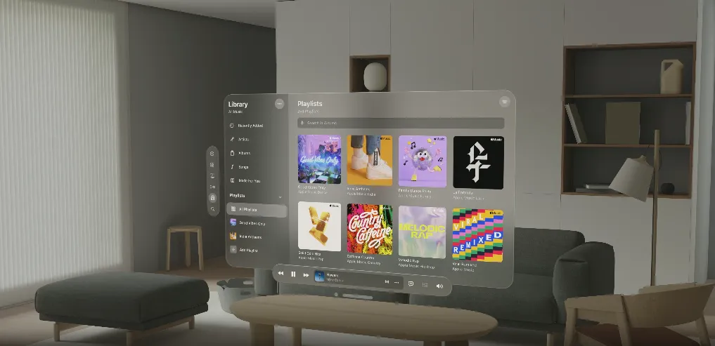
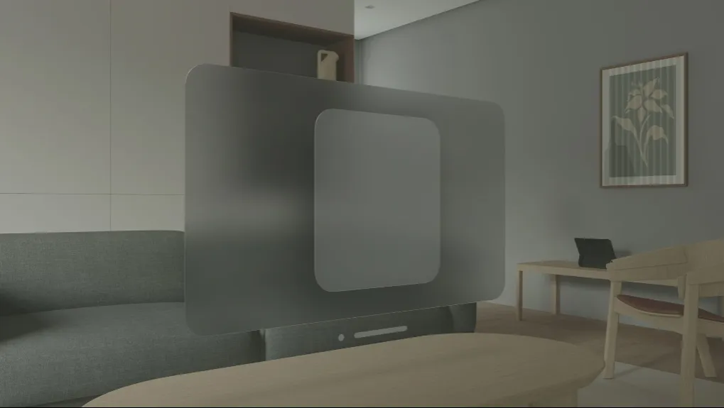
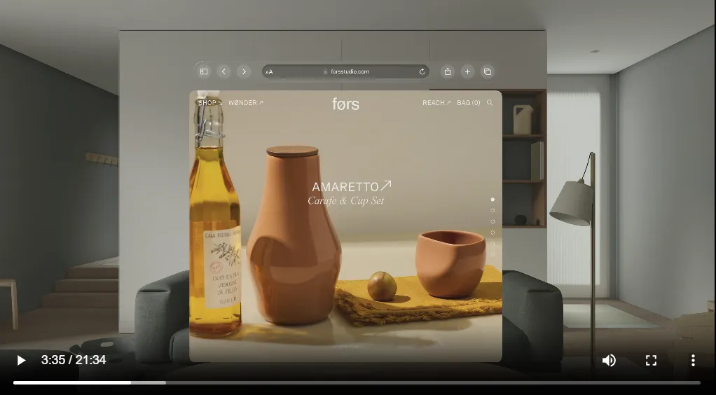
Of course we all love new UI trends and exploring different possibilities in the new devices! As users would have a completely different experience, it would also give us, UI/UX designers an opportunity to flashback and review some of the existing trends. One of Apple’s most beloved trends this time is glassmorphism. It will create a semi-transparent background that blurs a part of the background, showing the content in a clear, simple fashion. Previously glassmorphism has been widely used in credit card concept designs, mockups, and some design systems. Here is an example I did in my daily design practices.

In the new launch of Apple Vision, one of the main differences with existing Mixed Reality (MR) products like Meta Quest, is that Apple shows more on usability and professionalism, rather than the “interaction” and connectivity that Meta is embracing, as said in the letter from Mark Zuckerburg to Meta’s employee. This means a comfortable user experience and a professional clean look are critical. As the videos from WWDC23 mentioned multiple times, the OS interaction and feel need to “be subtle”, so that they will not make people feel dizzy or distracted from the tasks. Glassmorphism provides less burden to people’s eyes, has a gentler and clear look, and appears subtle when encountering some interaction, like fading away when not focusing, moving/being more transparent when people walk nearby, etc. Hence, this is why this trend is a perfect fit for the new Apple Vision Pro, offering the opportunity to keep daily uses more effortless and aesthetic.
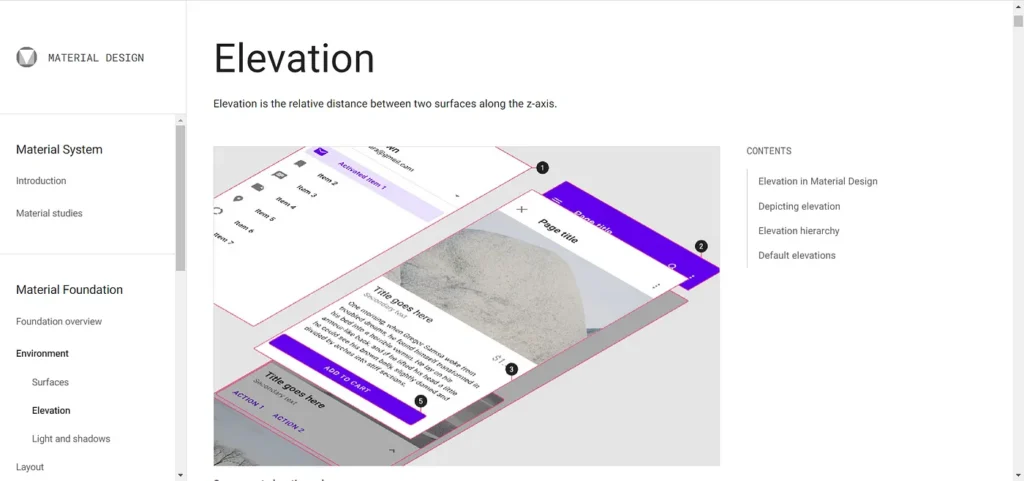
There are also some other design patterns waiting for designers to reinvent. The two most prominent ones would be depth and shadows. Depth has lived in designers’ world to define the hierarchy of page elements like navigation bars, side menus, etc. A great example would be Google’s Material Design. It defines a z-axis which is used to define the vertical distance between layers, indicating shadow distance, hierarchy, and focus of users’ attention.
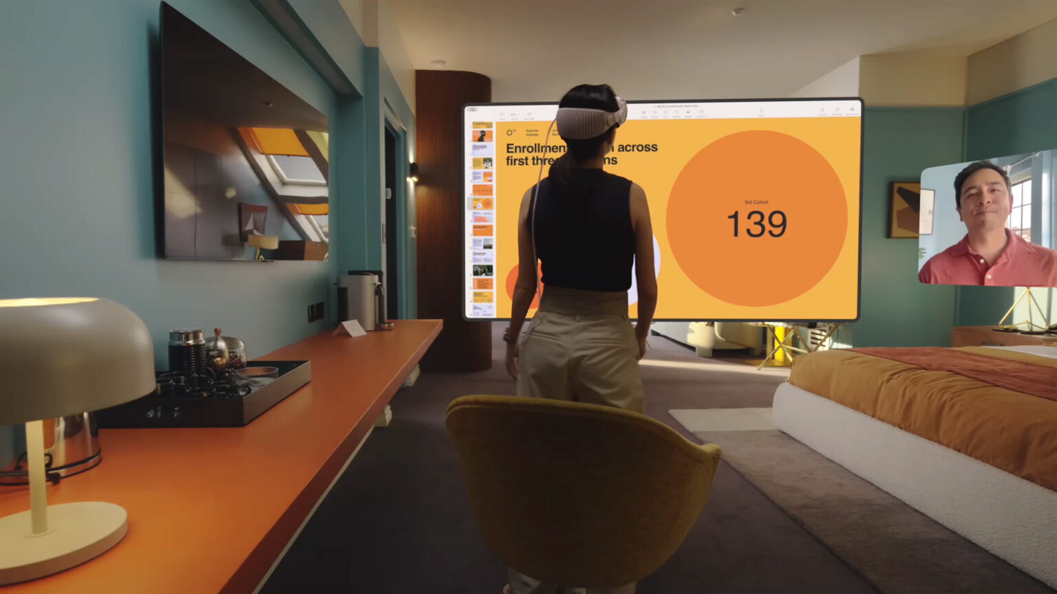
In the new Apple Vision Pro, depth becomes an independent factor that affects daily interactions, as people can choose the physical distance to the windows. Nearby windows would invite interaction and closeup observations from all angles; far-away windows are nice and large, presenting information while not blocking sights. The physical representation of the windows would add more emphasis and new creativity to interface design.
Similarly, shadows are also widely used in all UI design, from landing webpage to phone apps, almost everything we interact today will have some sort of shadows. In Apple Vision, this would be more Skeuomorphistic, which is a design style that matches more with actual objects you can see in real life. An example would be iPhone icons before IOS 6 or old Windows UI. Despite the stereotype associated with old-fashion and outdated, this concept stays gold and Apple Vision is another innovation to let it shine. In the image above, you can find a faint shadow of the window on the table. This is a way to promote the sense of space as well as real life in the system. This is an example of the light and shadow system; Apple sets it up by applying the concept of skeuomorphism in a very subtle way. Light emitters, like windows, content, or other immersive elements, would shine colors on the environment, creating subtle shadows just like lighting in real life does. This design shows the possibility of elevating users’ experience by transferring flat design elements to a 3D environment with careful considerations, which could be applied to other elements as well.
Auto-Sizing Windows
In our daily life interfaces, content is limited to a fixed-size window, either a phone size or tablet, or desktop. Designs are made to fit the window size. That’s why we have a responsive design with breakpoints to fit all sizes of screens our potential users are using, especially for webpages designs.
And this is gonna be changed. The reason is that windows can always auto-resize themselves in Apple Vision. When there is a need to elaborate a sidebar, Apple Vision can simply add another sidebar make is literally “pops out” without sacrificing readability to the original main content.
This would mean that designers are no longer limited to a set amount of pixels. Now we have unlimited space to put all content out if we want, the problem now falls to, what is a good amount? We of course don’t want to overwhelm our users (that’s why we have minimalistic design as a trend), but the extra space does have the potential to make the design more clear and accessible. This has constantly been a tradeoff. Since the new platform lifted the restriction on screen size, there can be more to consider when making design decisions.
Another interesting thought is what would happen to design in the rest of the world. As people might know, there is a great discrepancy in terms of design style between North America and East Asia (like Japan for example). Since North American design has adopted minimalistic design for a long time, I wonder if unlimited canvas would also be more overwhelming when East Asian designers from China or Japan enter the field, would their UI still be more overwhelming / content-heavy? Or how would it even map out, if we want to take full advantage of the unlimited canvas to lay out content? How would users feel about it? Are there any applications that might benefit? I cannot answer any of them right now, so we will wait and see.
Design for comfort
More Read

Comfort has always been a big consideration factor for overhead MR devices. People reported feeling dizzy or exhausted from the weight. Therefore, it is more critical to make sure any interface design will not add more burden to users. One of the main things Apple mentioned is to have everything subtle. Subtle shadows, glassmorphism for subtle transactions, subtle depth, and most importantly, subtle animation. Subtle animations include smooth predictable transitions; subtle motions (in the background) to change things alive and more. This would guide the users in their navigation path and establish the new norm that they will learn and get used to. Motions like fading are preferred as those will have a clear way to indicate if people go in or out of an immersive experience.
Another big part is accessibility. Apple, in its videos, indicated considerations for people with different postures, which shows the concept of inclusive design. Although most apps can expect users to stand or sit still to interact, they still need to take other possible postures into account.
Interactions
We have new ways to interact with computers now! Previously being hands (mainly fingers) and inputting devices (like mouse and keyboard). The new era is dominated by hand motions and eye motions. They would be tracked by sensors, ensuring accurate inputting.
For hands, now it is more effortless as your hands can basically confirm a click almost anywhere in the space, instead of clicking a mouse. There are also possibilities for multi-finger movements which is a concept that sort of failed when the iPhone carries it. This time, since the canvas and workspace are larger, it makes sense to reintroduce this concept to enable users to do more actions. Developers can also customize this which sounds super exciting for games. Just imagine actually slaying a dragon with your hands. Apple’s recommendations for custom gestures are easy to use, avoid conflicts, comfortable, accessible to people, and unambiguous. These, once again, emphasize some previous content which is comfort and user control.
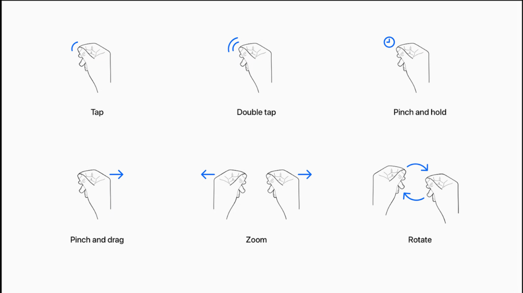
In the eye section, the addition of eye-tracking interaction can also be a smoother way of indicating users’ focus, compared to a mouse. For features like hovering, it would be easier to provide more information, which helps to make sure designs can suit all users in terms of conveying ideas.
However, we do have the privilege of sparing the mouse when using computers now. It would feel a bit weird to have our eyes triggering almost everything when we don’t want to. I believe this would be resolved once users get their hands on it and provide enough feedback.
With all those interesting features, I am thrilled to dive more into this concept. I know designer community on Twitter is starting to make mockup kits for the new system, which gives opportunities to designers like me to try out and explore the latest technology before it becomes the new trend. I will have more case studies on this and I can’t wait to get started.
Sources: