


Have you ever found yourself feeling a little too satisfied when one of your key UX metrics soared to new heights? If so, you’re not alone. It’s exciting to see those numbers go up, an affirmation that you’re doing something right, that you’re driving the experience in the right direction. But, is that single metric truly representative of the whole user experience? Or are we, as designers, simply falling into the trap of attributing too much importance to a single number, thereby risking the quality of the overall user experience?
This is where Campbell’s Law comes into play. It’s a rather sobering principle that originated from the social sciences but has profound implications for our work in UX design. In essence, Campbell’s law warns us that when a single measure becomes too important, it’s likely to be exploited and manipulated, leading to unintended consequences.
So, what does this mean for us, the gatekeepers of user experience? How do we navigate the world of UX metrics without falling into the single metric trap, and more importantly, how do we effectively leverage multiple metrics to truly capture and enhance the user experience? Let’s dive in and explore.

Understanding Campbell’s Law
Now, let’s take a closer look at Campbell’s Law. Formulated by social scientist Donald Campbell, the law warns:
The more any quantitative social indicator is used for social decision-making, the more subject it will be to corruption pressures and the more apt it will be to distort and corrupt the social processes it is intended to monitor.
That might sound a bit academic, so let’s break it down to our UX lingo. Imagine you’re relying heavily on a single metric, let’s say conversion rate, to assess the success of your new design. Now, everyone on the team has their eyes fixed on this single number. What happens next?
The design decisions start to cater more towards boosting this particular metric, often at the expense of other important aspects of the user experience. You might begin to implement aggressive prompts or create an intentional friction to drive conversions. But in the process, you could be ignoring, or even worse, sacrificing usability, accessibility, or overall user satisfaction. Why? Because these factors aren’t directly represented in that conversion rate you’re chasing.
Here’s where it gets tricky. While the conversion rate might be soaring high, you might be damaging the user experience in ways that could have long-term repercussions for your product. This is Campbell’s Law in action – the overemphasis on a single metric leading to distortion of the underlying system it’s meant to measure. It’s like we’re cooking a complex recipe but only tasting the salt – we might make it perfectly salty, but is the overall dish delicious? That’s the question we often forget to ask.
So how do we, as UX designers, avoid this trap and ensure that our measures truly enhance, and not distort, our user’s experience? Let’s delve into that next.
The Single Metric Trap in UX Design
So we’ve all been there, right? We’ve all been charmed by that one seemingly magical metric. It’s the number that goes up in board meetings, the statistic that gets the spotlight in our performance reports, the holy grail that determines our success or failure. And it’s understandable. It’s convenient, it’s quantifiable, and it feels like a direct reflection of the impact we’re making. But that’s the catch – this single metric, as seductive as it may be, is not the be-all and end-all of our UX design.
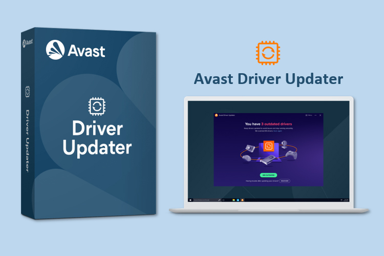
A few years back, I was working as a UX Designer at Avast, the cybersecurity company. I was part of the team handling the Avast Driver Updater, a tool that automatically scans and updates drivers to ensure your PC is functioning optimally. The metric we were obsessed with at the time was “successful driver updates”. It made sense, right? More successful updates meant our tool was doing its job, ensuring our users’ systems ran smoothly with the latest drivers.
However, I remember we started noticing a trend. While successful driver updates were indeed going up, the overall customer satisfaction wasn’t following the same trend. Users were still reporting problems, expressing their frustrations about the software’s usability. We were perplexed. We were hitting our target metric, but users were still unhappy. How could that be?
This was the wake-up call we needed. We were so fixated on this single metric that we had lost sight of the overall user experience. The software might have been updating drivers successfully, but if the user interface was confusing or the update notifications were intrusive, the user’s experience was still poor. Our single-metric focus was hiding these critical usability issues from our view.
This realization was a turning point for our team. It was clear that to enhance our user experience genuinely, we had to broaden our focus, consider a more comprehensive set of metrics, and most importantly, listen to our users’ voices. It was our first step away from the single metric trap and towards a more holistic understanding of user experience, which then led to rebranding the whole Avast Driver Updater product.
The problem with a single metric is that it often tells a partial story. It might give you a view of one facet, but it may obscure other equally important aspects of the user experience. And when we focus too much on optimizing that one metric, we might unintentionally push aside other design elements that contribute to a holistic user experience.
Let’s consider another example. Say you’re running a music streaming service and your primary metric is “time spent listening”. You might think,“Great! The more time users spend listening, the better our product must be, right?” But is that always the case? Are users genuinely enjoying their experience, or are they simply unable to find that one song they’re looking for, hence the prolonged time spent on your platform?
Just like the music streaming example, if you’re constantly pushing to increase “time spent listening”, you might be missing out on ways to improve user navigation, playlist customization, or even sound quality. In other words, by over-optimizing one metric, we risk neglecting other areas that could provide immense value to our users.
Herein lies the single metric trap in UX Design – it’s like driving with a tunnel vision, only seeing what’s straight ahead while missing what’s happening on the sides. But fear not, there are ways to escape this tunnel and widen our view, and that involves a paradigm shift towards a multi-metric approach. Curious? Let’s unfold this further in the next section.
Embracing a Multi-Metric Approach
Alright, so we’ve acknowledged the pitfalls of becoming overly attached to a single metric. So what’s next? How do we move forward and break free from this trap? The answer lies in diversifying our metrics portfolio. Think of it like investing. Would you stake all your savings in a single stock? Probably not, right? You’d spread your investments across various assets to balance the risk and maximize returns. Similarly, we need to broaden our evaluation parameters in UX design and embrace a multi-metric approach.
Adopting a multi-metric approach means going beyond that one golden metric and taking into account a broad array of indicators that reflect the overall user experience. This approach enables us to maintain a holistic view and understand the user journey from multiple angles. So, alongside ‘time spent listening’, you might want to track ‘number of songs played’, ‘number of playlists created’, or even ‘frequency of use’.
But wait, won’t tracking more metrics complicate things? It might seem so, but here’s where the beauty of a multi-metric approach comes in. It not only provides a fuller picture of the user experience but also reveals how these metrics interact with each other. For instance, if ‘time spent listening’ increases, but the ‘number of songs played’ decreases, it could indicate users are leaving your app running without actively engaging with it.
Remember, though, that a multi-metric approach isn’t about bombarding your dashboard with every possible metric. It’s about strategically choosing a set of metrics that together, offer a comprehensive understanding of the user experience. And guess what? This approach can actually make your design decisions more robust, insightful, and user-centric.
So now we’ve got our metrics sorted. But is that all? Is there something beyond these numbers that we might be missing? Well, we’re glad you asked! Let’s bring in the human touch and explore how qualitative data can supplement our metrics in the next section.
Supplementing Quantitative with Qualitative Data
Let’s shift gears a little bit. While metrics and numbers provide us a convenient way to measure user behavior, they often miss out on capturing the richness and depth of the user experience. That’s where qualitative data comes into play. It’s time we went beyond the WHAT of user behavior to understand the WHY.
While quantitative data can tell you that users spent a long time on a particular page or clicked on a specific button, it doesn’t tell you why they did so. Did they find the content engaging, or were they confused? Did they click on the button because the call-to-action was compelling, or was it an accidental click? The answers to these questions lie in qualitative research methods.
Qualitative data brings the much-needed human touch to our design process. It’s about having conversations with users, understanding their motivations, their frustrations, their needs, and their preferences. It’s about observing their behavior, noticing their hesitations, their delights, and their confusion.
Consider incorporating user interviews, usability testing, field studies, and diary studies into your research process. Use these methods to probe deeper into your users’ minds. For instance, if you notice through your metrics that users are abandoning a task midway, don’t just speculate the reasons based on numbers. Instead, have a one-on-one conversation, observe users as they interact with your design, ask them what’s stopping them from completing the task.
Pairing qualitative insights with quantitative data can give you a well-rounded understanding of your user experience. It can reveal the story behind the numbers and can guide your design decisions in a more empathetic and user-focused direction.
So, are you ready to break free from the single metric trap and take a more holistic approach to measure and enhance your user experience? Let’s summarize our journey and key takeaways in the concluding section.
Conclusion
Fellow UX designers, in this article we’ve dissected Campbell’s Law, understood its relevance in our UX universe, and acknowledged the risks associated with overemphasizing a single metric. It’s been a sobering reminder that no matter how attractive a single number may appear, it’s rarely the whole story. And when we design with tunnel vision, focusing on just one facet of the experience, we risk distorting the very essence of what we seek to enhance – the holistic user experience.
But don’t let this cast a gloom over your UX endeavors! Instead, let it guide you towards a more balanced, comprehensive way of understanding and shaping user experiences. Embrace a multi-metric approach, diversify your evaluation parameters, and unlock the potential of multiple metrics working in harmony.
But wait, there’s more! Don’t forget to bring in the human touch. Supplement your quantitative data with rich, qualitative insights that offer a deep dive into your users’ minds. Go beyond the surface, ask the why’s, understand the motivations, and embrace the complexity of human behavior.
Remember, in the grand scheme of UX design, metrics are just tools to help us navigate. They are signposts, not destinations. The real end goal is always the user – their experiences, their needs, and their satisfaction. So, let’s take a step back from the numbers, broaden our view, and continue crafting experiences that truly resonate with our users. After all, isn’t that what we, as UX designers, set out to do?
Happy designing, and until next time, keep challenging, keep learning, and keep growing!
Important Notice: The articles, insights, and opinions I express here on UX Parrot are solely my own, arising from my personal journey in the UX industry. They do not represent or affiliate with the views or stances of any organization I’ve been associated with in my professional capacity, past or present. Sina Ranjbar.