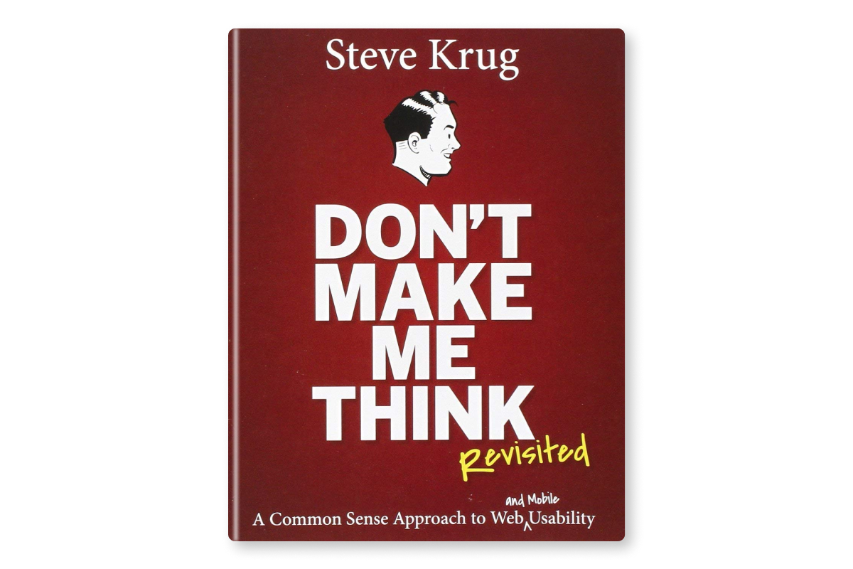
As an author, it can be hard to know when you’ve hit a home run with your work. After all, you spent months or even years writing it, and the slightest mistake could potentially make people not want to read it. In his new book, Don’t Make Me Think: A Common Sense Approach to Web Usability, Steve Krug takes a different approach. Rather than agonizing over every detail of your website or blog post, Krug advocates for simplifying your content so that users can understand it right away.
If you’re interested in learning more about ui/ux design, or want to improve the effectiveness of your own designs, read Don’t Make Me Think.
The book is structured in a way that makes it easy to read. Each section is short, with examples that illustrate its points.
Quotes from the book:
If something requires a large investment of time — or looks like it will — it’s less likely to be used.
Making every page or screen self-evident is like having good lighting in a store: it just makes everything seem better.
It doesn’t matter how many times I have to click, as long as each click is a mindless, unambiguous choice.
Get rid of half the words on each page, then get rid of half of what’s left.
Your objective should always be to eliminate instructions entirely by making everything self-explanatory, or as close to it as possible. When instructions are absolutely necessary, cut them back to a bare minimum.
Important Notice: The articles, insights, and opinions I express here on UX Parrot are solely my own, arising from my personal journey in the UX industry. They do not represent or affiliate with the views or stances of any organization I’ve been associated with in my professional capacity, past or present. Sina Ranjbar.


