

As a student designer starting to learn UI/UX, one of the most significant questions I have was:
Okay, I have my research now, how do I translate that to visuals so that users’ issues can be solved?
In the first couple of of years practicing, I felt a great disconnect between UX and UI. I may practice UX research and empathizing activities without trouble; I can also make some decent-looking screens, but how can those connect? In case studies, this would reflect as one of the following behaviors:
- Finishing some screens but don’t know how these would relate to helping users achieve their goals
- Don’t know where to start/cannot identify UX goals when looking at screens
- Do features just because they are cool features
- Finding it hard to justify why features can solve pain points when writing portfolios/answering interviewing questions.
Those are some of my personal struggles; other people may have other ones, but this is the problem, the disconnection between research outcomes and visual presentations.
After two years, I found that the problem is quite simple, it is wireframing. There are lots of great articles around illustrating how to do a proper wireframe, which I am not going to repeat. What I want to discuss is some personal understanding of making and using wireframes as it is a critical step connecting abstract ideas and a visual prototype that you can add more styles and elements later on. I would explore the pre-wireframe steps, wireframing, and post-wireframing (which is more important in my opinion, translating ideas to visuals). In this article, I would use the case study on BeReal redesign as an example as I did the visuals. The link to the case study can be found here.
Pre-Wireframing
In one my articles about content mapping, I mentioned one of the great advantages of outlining specific information for each page/topic. This would include text input fields, key information that users are seeking, call-to-action buttons, etc. Besides its benefits in communicating with other stakeholders, it would give us as designers a more holistic view of how the information flow is mapped out.
First, after I have a new feature idea, I would put them down to a series of chronological steps. In this example, the feature is aiming to let an organization (such as a class or a company) engage in a challenge in BeReal. Each individual would be given the same prompt and they would think about creative ways to include the elements in the prompt in their updates. So this would generate a list of actions users will either see or do in the feature. It will look like this
- Users get a notification about organizational prompt BeReal.
- Users open up the app and find the entry to the prompt.
- Users would take a BeReal picture like usual, and upload it.
- Users would see the results of others and some sort of feedback.
After this we put that into a content map, making these main steps as a skeleton. We split the flow into two circumstances, the main flow as said above, and the flow for users that have already completed the challenge. (And they will skip the first three steps)
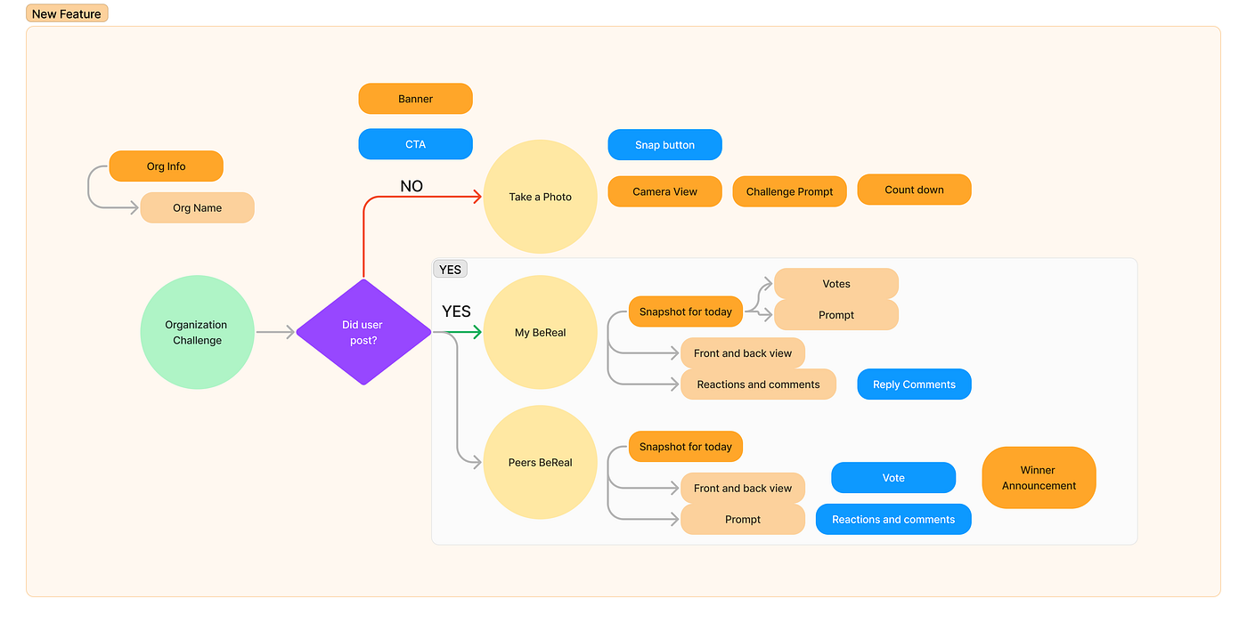
When thinking about what elements belong to each screen, keep in mind the users’ goal, as identified before. For instance, the users want to hear feedback. What might be some sort of feedback they can see how they are doing with regard to the prompt? They can see how many people liked it (or voted it since it is company-wide activity), and see people’s reactions and comments. Hence, to obtain feedback, on the screens for my BeReal, I need ways to see the amount of votes, reactions, and comments. When seeing others’ posts, I would need ways to vote, react, and comment. And these are buttons or field inputs. This is the basic route to getting all the details, like the light orange boxes, for each topic.
With this map in hand, we can know a basic amount of how many main screens we would be having in this feature, as I outlined them in orange blocks. (in this case, there will be around 3 screens for the “take a photo” flow, one long thread screen for viewing self’s and people’s BeReal, around 2 complementary screens like commenting or details, 1 screen change for the banner) Then we elaborated a bit on what information we should include for each screen and step, as outlined in the light orange blocks, and call-to-actions in the blue blocks.
With these, we are ready for the actual wireframing, meaning putting the words and screen descriptions we’ve written, into actual low-fidelity mockups.
Wireframing
There are plenty of articles illustrating wireframing, such as the one from Designerrs Academy, talking about how a wireframe can benefit designers. And I bet you can also find more articles saying wireframing is paper sketches or an easier way to lay down ideas, which is not wrong. But as a beginner designer before, I struggle to do the seemingly easy work. I often, either get stuck on wireframing or ended up with an almost useless wireframe which I threw out of the window when doing actual design, meaning that they don’t translate well to medium or higher fidelity designs. So I am going to show my way of it now.
It of course starts with the content map. Previously we’ve nailed down the content for each page for users to see. Then we break into screens with those content. For example, in the view self’s and other’s screen, I would write down, on an empty block:
- self’s BeReal: front and back view, current votes, current reactions, location, time.
- other’s BeReal: front and back view, name, location, button to vote, button to comment, time.
Hence, we can put them into blocks. Like Below:
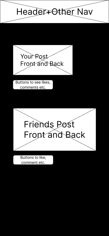
This is what I called content framing, which is putting content into blocks with respective sizes. The main thing we trying to focus on here is hierarchy. We need to identify, among all the content displays, which one would be more important, and which might be less important. It is also a good time to distinguish between different types of information on a page such as buttons, user input fields, and displaying content.
In this particular example, the image posts would be the most important portion, especially other people’s since these are the main reasons why people use this app: sharing and seeing other people’s updates. After that, we have a few buttons to interact with people using likes and comments. These are the main features, which users can feel value within the experience. Other than that, we have navigation, which is more usability side of things. Users still would like to navigate around different parts of the application; hence, we have a header bar and navigation on the top. In this example, they are combined due to the fact that BeReal has navigation on the top section. Since it is a feature addition, we do not have the intention of changing the current experience too much. In other cases, there might be a bottom navigation or something more.
After this, we can try to elaborate a bit more. We can try to add a bit more structure with the help of our understanding of the BeReal app. We can add a navigation bar, and put our feature into the navigation since we want it to be a core feature, having the same hierarchy as the current flow. We can use the structure that BeReal has for showing posts. Then we can get:
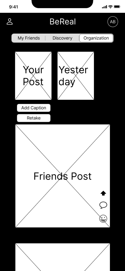
This is a pretty good wireframe with accurate information and reasonable structure that can be used to make it into higher fidelity screens.
This is why feature addition is quite friendly for beginner designers to practice. If we are not talking about feature development, then we need to enter the next step which is visual directions.
Visual Directions:
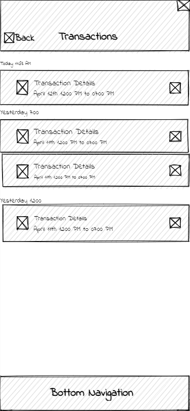
Now let’s talk about a completely new project that you are starting and there is no set visual structure. A critical step is to find a visual direction. In this step, we don’t necessarily need to select a specific color palette or animation. Instead, we want to focus more on structure and layouts. For example, if you are designing a professional banking app, then a great focus would be laying out long lists of information like banking statements or transactions. Then its structure needs to be professional, minimalistic. This would translate to probably space conscious, meaning we want to use the smallest space possible to contain the most information when keeping things eligible, since it will reduce scroll time and present the information directly. Hence there would be shorter container rows, lots of interactable elements (like row elements might be clickable and lead to a more detailed page), less lively animation, and less rounded corners card designs. Hence, the spatial consciousness can be reflected by having more full-screen length elements and minor margins with dividers.
More tips:
Some more tips in this phase from my experience: number one is real text instead of Lorem Ipsum. I found this helpful as this can help me understand my current work and communicate with others for feedback. This doesn’t mean spending time on actual technical writing, which is not the focus in this phase. Just like the example above for banking, instead of meaningless text, I used simple words like “transaction details” or actual time stamps. (this can mimic the feel of a real app with a balance of how much text, numbers, and text-image relationship)。
Another tip is to look into the concept of atomic design, which is the basis of most design systems here. In one sentence crash course, it is designing from the real details (like a text font, a text size, an icon, etc), and building your designs based on the same little details to make sure things are cohesive. Although we are not touching colors or exact text faces in this face, this concept can still help us by making sure we are reusing components, to help make designs more unified and easy to treat when coming to visual designs.
Post-Wireframing
After making an effective wireframe, the next step would be translating this more into a visual prototype. This would require continuous visual research with direct competitors, indirect competitors, and visually matching products. This can be elaborated more in a future blog post. But here is the high-fidelity screen for the BeReal example, extended from the wireframe.
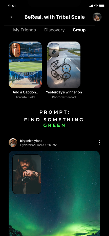
You can see that the structure remains relatively the same, with a small addition of information about the prompt. That is a sign of an effective wireframe which actually helps the design process.