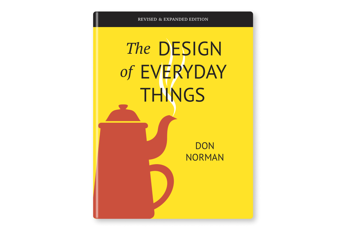
The Design of Everyday Things is an important work by cognitive scientist Don Norman in the 1980s. The original title of the book was The Psychology of Everyday Things. Later, it changed its name because the author believed the new title better conveyed the content of the book and better attracted interested readers.
The book is considered a fundamental read for every designer, and recommended to anyone who approaches the world of design. Despite being several years old (the first publication is from 1988), the concepts that Don Norman deals with are applicable to any area of design
Who has never had to push a door instead of pulling it or give up washing their hands because they had trouble using the taps (faucets)? In these cases the feeling of personal incapacity is very strong: yet, Norman argues, the fault lies not with the user, but with those who designed these everyday things without considering normal mental activities of the people who are going to use those things.
According to Norman design on a human scale combines psychology and technology to create new products, but above all easy to use, understandable and, why not, also capable of giving pleasure. Because making and thinking about “human” products and services means changing our idea of the world.
Quotes from the book:
Design is really an act of communication, which means having a deep understanding of the person with whom the designer is communicating.
Rule of thumb: if you think something is clever and sophisticated beware-it is probably self-indulgence.
Good design is actually a lot harder to notice than poor design, in part because good designs fit our needs so well that the design is invisible,
A brilliant solution to the wrong problem can be worse than no solution at all: solve the correct problem.
Principles of design:
1. Use both knowledge in the world and knowledge in the head
2. Simplify the structure of tasks.
3. Make things visible: bridge gulfs between Execution and Evaluation.
4. Get the mappings right.
5. Exploit the power of constraints.
6. Design for error.
7. When all else fails, standardize


