Introducing Sharly AI: What is it All About?
Alright, fellow UX enthusiasts, imagine this scenario: You’re faced with a 50-page document filled to the brim with complex information, and you’re expected to digest all that content in a blink. Does this send a shiver down your spine, or is it just me? If this situation resonates with you, then you’ll love to meet Sharly, a cutting-edge AI tool designed to simplify this very process. Sharly is in the business of making document interactions easy, engaging, and even enjoyable.
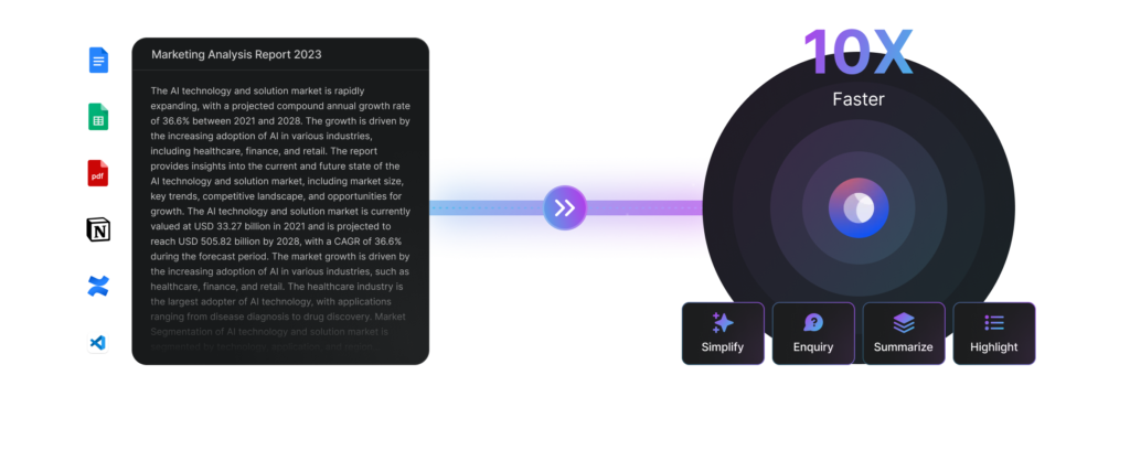
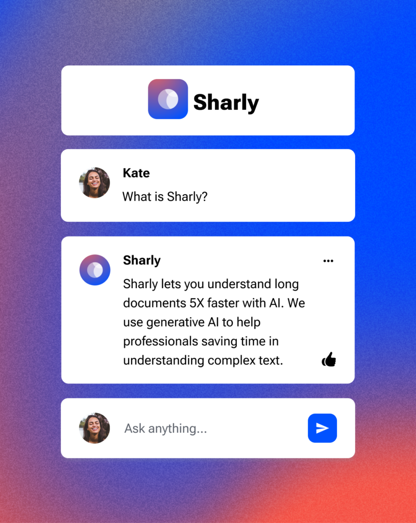
First things first, let’s discuss Sharly’s raison d’être. Sharly’s sole purpose is to transform complex, lengthy documents into friendly stories, allowing you to comprehend critical information more efficiently. It’s an innovative AI productivity tool that not only summarizes and simplifies your documents but also does it with an AI-enabled, conversational interface. Think of it as your digital document whisperer.

The User Journey: Uploading and Processing Documents with Sharly
Here’s how it works. You upload your document onto Sharly’s platform, and it gets to work, analysing the content and turning it into a discussion. But Sharly doesn’t just make a mere summary; it creates an interactive experience.
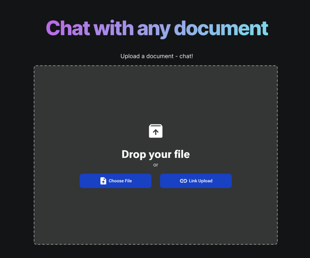
As UX designers, we know how vital the first user interaction is. Sharly sets the tone right with a clean, inviting homepage. A box to upload a document sits right there, waiting for the user to start the magic. The document uploading process is sleek and straightforward, a refreshing change from many other tools on the market.
Once the document is uploaded, Sharly serves up a set of “ice breaker” questions tailored for the document to guide the user on how to begin the interaction. Moreover, it provides users with ready prompts like ‘Simplify’, ‘Highlight’, ‘Sentiment’, and ‘Summarize’ to set the discussion rolling.

And here’s the cherry on top: Sharly allows users to customize the AI’s scope of information and the desired length for the responses. ‘Focused’ keeps Sharly strictly within the document, while ‘Expanded’ allows Sharly to incorporate its general knowledge. Shorter answers are more concise, while longer answers provide more details and context.
One can’t help but admire Sharly’s aesthetic appeal as well. Its layout is neat and clean, visuals are pleasing, and every design element underscores that you’re using an AI tool – a nod to the blending of functional design and visual storytelling. All in all, it is transforming the way we process documents.
Unpacking the User Need for Easier Document Processing
Now, let’s talk about the elephant in the room: The constant struggle with complex documents in our professional lives. Is it just me, or does everyone secretly wish for a fairy godmother who could wave a magic wand and turn these convoluted documents into delightful, easy-to-understand narratives?
Well, folks, that’s exactly the need Sharly tapped into. It saw the chasm between the information overload of extensive documents and the time crunch faced by busy professionals and thought – “Hey, why not bridge that gap?”
But as UX designers, we know it isn’t just about identifying a need. It’s about empathizing with the user, understanding the pain points in their journey, and then crafting a solution that seamlessly fits into their workflows. Sharly took these principles to heart.
Consider the user journey on Sharly. Right off the bat, it provides a frictionless document uploading process. It doesn’t stop at making this task simple; it aims to make it inviting. The UX intent here is to build an interaction that’s effortless but also engaging enough to pique the user’s curiosity.
Once the document is up, the AI doesn’t just leave the user wondering, “What’s next?” It provides clear, helpful prompts and ‘ice breaker’ questions. This eases the user into the process and helps them understand how to engage with the tool.
Finally it also allows users to tailor the AI’s knowledge scope and the length of responses, offering a sense of control in the process.
All of this reveals a UX-centric approach to solving a pressing problem: making document interactions easier. It illustrates the strength of empathy-driven design and, honestly, it’s a breath of fresh air in the space of document processing tools.
The Ideal Sharly User
An AI productivity tool for summarizing and simplifying long documents is potentially valuable to a broad audience. Although we are not aware of specific details about the company’s marketing strategy or intended audience, we guess their target audience come from various walks of life. To illustrate, let’s take a look at their possible user persona:

🧑🏻💼The Professional
Alex, a 35-year-old project manager.
Drowning in documents, Alex needs quick, reliable summaries and insights. Sharly’s on-demand summaries and easy-to-use interface are a lifeline, turning lengthy reports into digestible bites.

🧑🎓The Student & Academic
Emma, a 24-year-old PhD candidate.
Emma’s life revolves around dense academic papers. With Sharly, she can pull out critical information, making her research process more efficient.

♿️ The Accessibility User
Bill, a 60-year-old visually impaired user
Sharly’s ability to simplify and narrate documents creates an inclusive environment, enhancing his document interaction experience.

📰 The Journalist & Writer
David, a 40-year-old journalist.
Time-pressed, David relies on Sharly to sift through large amounts of information quickly. Sharly’s sentiment analysis feature adds an extra layer of insight to his work.

👔 The Government Employee
Sara, a 38-year-old policy analyst.
She leverages Sharly to parse through intricate legal and policy documents, aiding her work in public policy development.
Each persona brings unique needs and challenges to the table, yet Sharly serves them all. Its strength lies in its adaptability and commitment to an intuitive, user-centric design approach. And that, my friends, is what we call a UX home run.
Evaluating the Competitive Landscape: How Do Sharly’s Rivals Stack Up?
Competition is an exciting part of our UX universe, it drives innovation and keeps us on our toes. And in the realm of AI document interaction tools, the play is fierce.
First up, we have Docalysis. Now, it does provide a side-by-side document-chat view (one up for them), but the lack of aesthetic finesse and user-friendly interaction design places it a step behind Sharly.
Next in line, we have Pdf.ai. This platform shares the document-chat view plus, it highlights source text in the uploaded PDF – a feature that appeals to our designer brains. But the overly cluttered UI and those pesky ads on their website can’t help but raise some eyebrows. Not to mention the strangely flat pricing and inaccurate results, it just doesn’t meet the Sharly standard.
Then there’s DocuAsk, which also boasts the side-by-side view and multilingual support. However, again, the UI aesthetics and user-friendly design fall short when compared to Sharly.
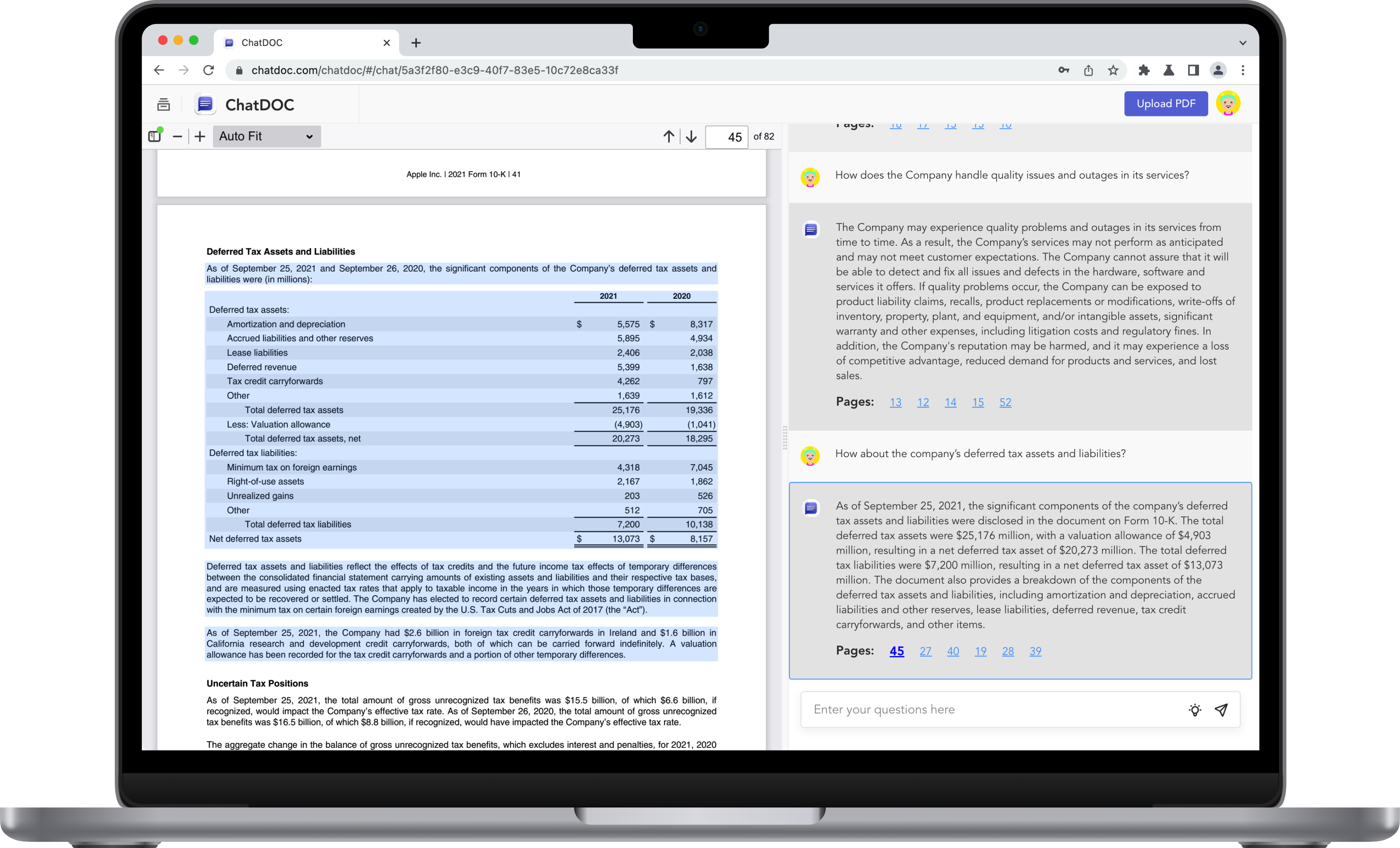
Last but not least, ChatDOC enters the arena. With its side-by-side document view, source text highlighting, and sample questions, it does pose a challenge. Yet, the lack of ready prompts and a slightly awkward UI design tips the scale in favor of Sharly.
Here’s the rub, folks: In the grand UX design scheme, Sharly excels at combining simplicity, functionality, and aesthetics. Sure, it could learn a trick or two from the competition (side-by-side view, anyone?), but the overall package is a promising step forward in the AI document interaction space. And we, as UX designers, can’t wait to see where this leads.
Behind Sharly’s Rise as a Go-To Tool for Document Simplification
Let’s step into the time machine, folks, and revisit the journey of Sharly. What has propelled this AI tool to its current stardom in the document interaction realm?
First, its UX design choices. The interface is simple, uncluttered, and engaging. The primary actions are clear, and the responses from the AI are easy to follow. In a world of chaotic information, this simplicity is like a soothing balm.
Then there’s the features – the ‘ice-breakers’, the ‘ready prompts’, all of which contribute to an inviting user experience. They ensure users aren’t left dangling, wondering how to engage with the tool.
But we can’t overlook another huge plus point – Sharly’s pricing strategies, and the choice to offer a free forever ‘Personal’ plan which allows up to three documents with limited conversations – a perfect fit for individual users and those who are interested in testing the utility of this tool.
I asked some friends to take a look at it. Their feedback has been overwhelmingly positive. Users have applauded its easy upload process, clear prompts, and the ability to tailor the AI’s knowledge scope. They’ve also appreciated the system’s swift responsiveness and personalized document interactions. The consistent praise in user reviews indicates a high level of user satisfaction, fueling Sharly’s rise.
So, to all my fellow UX designers, Sharly has listened to its users, addressed their needs with thoughtful design, and managed to deliver a product that’s not only functional but enjoyable. In a nutshell, Sharly’s success story is a testament to the power of good UX design.
Anticipated UX Enhancements and Future Directions
Sharly’s success thus far doesn’t mean that it has reached the pinnacle of its UX potential. On the contrary, it’s on a journey of continuous improvement to perfect the user experience. In line with that, let’s discuss a number of enhancements that could further elevate Sharly’s UX and usability.
First, there’s the document side-by-side chat view, a feature that some of Sharly’s competitors already offer. This is something that Sharly could potentially incorporate to further enhance the user’s experience. Imagine having your chat and document view in the same frame, offering an uninterrupted, fluid interaction with the document while engaging with the AI.
Then there’s the notion of highlighting the source of answers within the uploaded document, a feature currently missing from Sharly. By showcasing the exact location from where an answer was derived, users gain context and confidence in the responses provided.

Let’s also consider the addition of multilingual support. As Sharly’s user base expands globally, catering to users in their native languages could significantly enhance usability and inclusivity, opening doors to diverse markets.
Finally, the implementation of a more advanced AI could be on the horizon. While Sharly already impresses with its smart conversational AI, imagine if it could anticipate your questions based on previous interactions or even based on the documents you’ve uploaded? This kind of predictive technology could revolutionize the way we interact with documents, marking a new milestone in Sharly’s UX journey.
On top of all these, we also see immense potential in a few other areas. These enhancements could catapult Sharly into a class of its own:
- Improving the Accessibility features for The Accessibility User: Inclusivity should be a standard, not a feature. Sharly should strive to cater to users with diverse abilities by providing comprehensive accessibility features. This can include voice-to-text and text-to-voice options, screen reader compatibility, high contrast mode, and more.
- Data Safety Assurance: Transparency builds trust. To alleviate any concerns regarding data security, Sharly should clearly inform users about how it protects their data during the upload process. This could be achieved through reassuring prompts or an easily accessible data security policy.
- Improved Text Interaction: It’s all about readability and understanding. We see potential in enhancing answer formatting to help users quickly grasp key points. This could involve bolding key words or phrases, underlining links, and allowing users to customize the font size and colors for a personalized reading experience.
We’ve come to expect innovation from Sharly, and these are just a few possibilities for its future. As UX designers, it’s exciting to envision where this journey will lead next.By integrating these enhancements and persistently focusing on improving the user experience, Sharly can go from good to great, becoming an even more powerful tool in the hands of users around the world.
Final Reflections on How Sharly is Enhancing the Document Interaction Experience
As we close this deep dive into Sharly’s innovative approach to document analysis, it’s worth pausing to reflect on the profound shift this tool represents in how we interact with text.
For years, we’ve been conditioned to a traditional interaction model: a cold, one-dimensional, almost binary relationship with the written word. The user, armed with patience and focus, would skim through lines upon lines of text to extract insights, occasionally grappling with the frustration and fatigue that accompany this laborious process.
Enter Sharly, which replaces this mundane method with a lively, conversational interface. It’s a simple yet radical transformation, turning the erstwhile static relationship with a document into a dynamic dialogue.
Imagine being able to chat with your document, engaging it with questions as naturally as you would in a conversation. Suddenly, your document is not just a repository of information, but a friendly assistant that’s always ready to help. It’s no longer a monotonous read; it’s an engaging chat, an enjoyable experience. That’s the power of Sharly.

As UX designers, we know that details matter. Not only in design but in the way we interact with users. So, introducing a conversational interface in document analysis might seem like a small change, but it significantly alters the user experience. It’s an embodiment of Marshall McLuhan’s famous quote:
The medium is the message.
Marshall McLuhan’
The mode of communication in itself delivers a potent message, shaping how we perceive and engage with the information.
In transforming the medium through which we interact with documents, Sharly is effectively revolutionizing the message. The transition from a linear reading experience to a dynamic, interactive engagement has a profound impact on user perception. It makes document analysis more palatable, inviting, and effective.
Yet, as exciting as these enhancements are, they represent just the beginning of Sharly’s journey. By constantly iterating on the design and implementing user feedback, Sharly continues to evolve, pushing the boundaries of what’s possible in text interaction.
In essence, Sharly is more than just a tool. It’s a testament to the power of thoughtful UX design. It’s a reminder that by rethinking how we interact with everyday tasks and challenging the status quo, we can create experiences that not only make life easier but also a touch more delightful.
In conclusion, the future of document interaction is here, and it’s conversational. It’s dynamic. It’s engaging. And with Sharly leading the way, we can’t wait to see where this journey takes us next.
Important Notice: The articles, insights, and opinions I express here on UX Parrot are solely my own, arising from my personal journey in the UX industry. They do not represent or affiliate with the views or stances of any organization I’ve been associated with in my professional capacity, past or present. Sina Ranjbar.


Amazing analysis, love the tool. Thanks for sharing such a detailed description of one of my favorite tools ever.